
This page provides an up to date view of the Global Decadal Climate Bet.
Details of The Bet are available at NoTricksZone here.
Update at 9 years and 11 months: November 2020 (month 119/120)
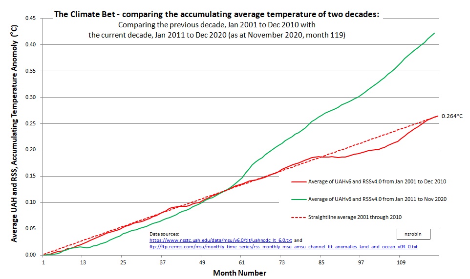
Worksheet with data available here.
Update at 9 years and 10 months: October 2020 (month 118/120)
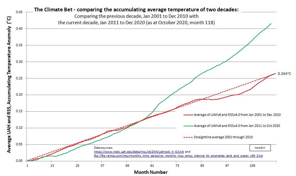
Worksheet with data available here.
Update at 9 years and 8 months: August 2020 (month 116/120)

Worksheet with data available here.
Update at 9 years and 5 months: May 2020 (month 113/120)
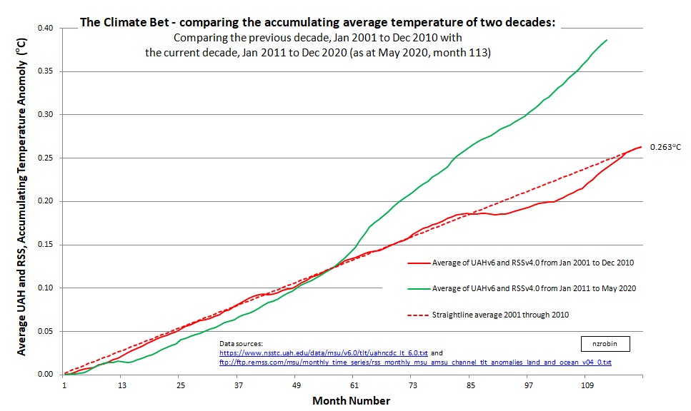
Worksheet with data available here.
Update at 9 years and 2 months: February 2020 (month 110/120)
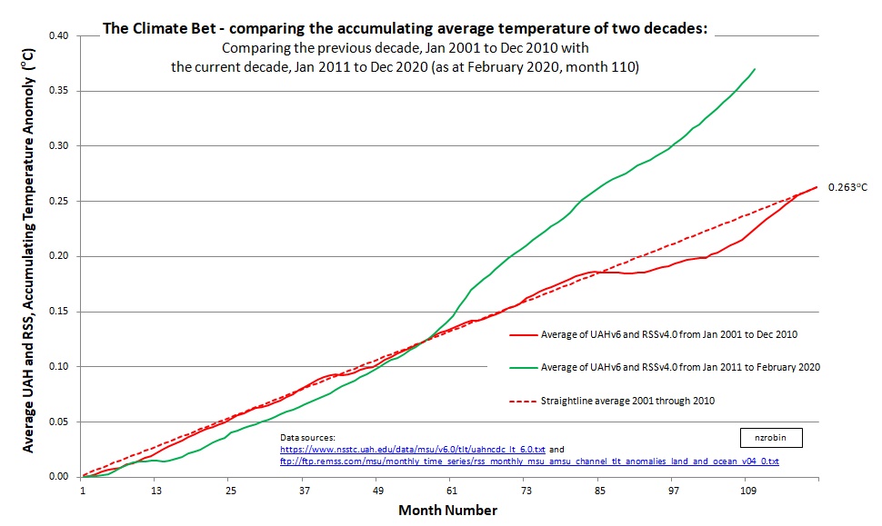 Worksheet with data available here.
Update at 9 years: December 2019 (month 108/120)
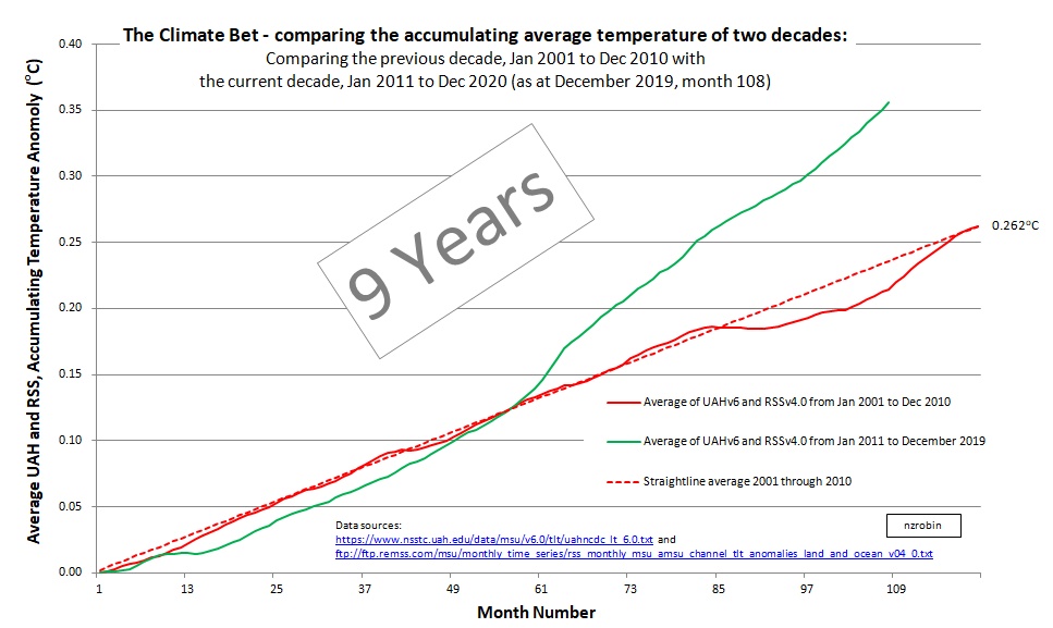
Worksheet with data available here.
Update at 8 years and 11 months: November 2019 (month 107/120)
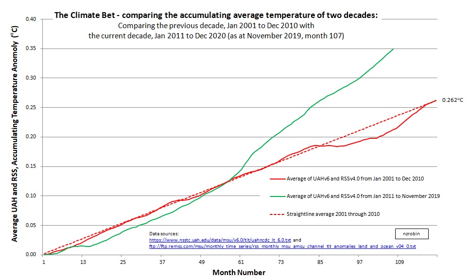
Worksheet with data available here.
Update at 8 years and 10 months: October 2019 (month 106/120)
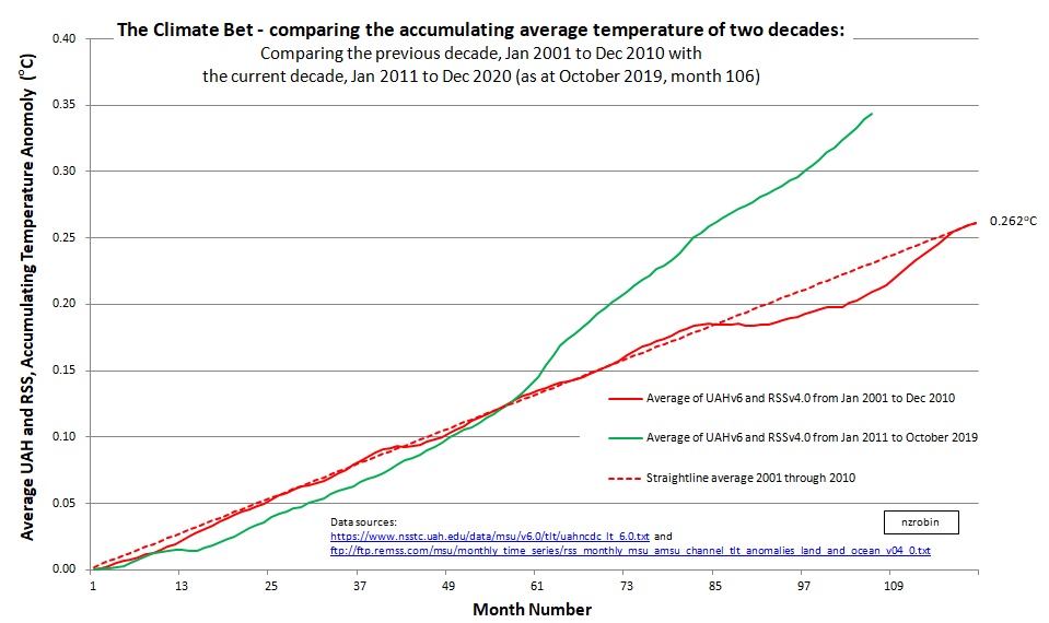 Worksheet with data available here.
Update at 8 years and 9 months: September 2019 (month 105/120)
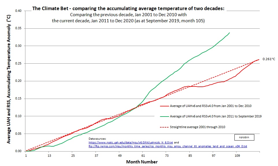
Worksheet with data available here.
Update at 8 years and 6 months: June 2019 (month 102/120)
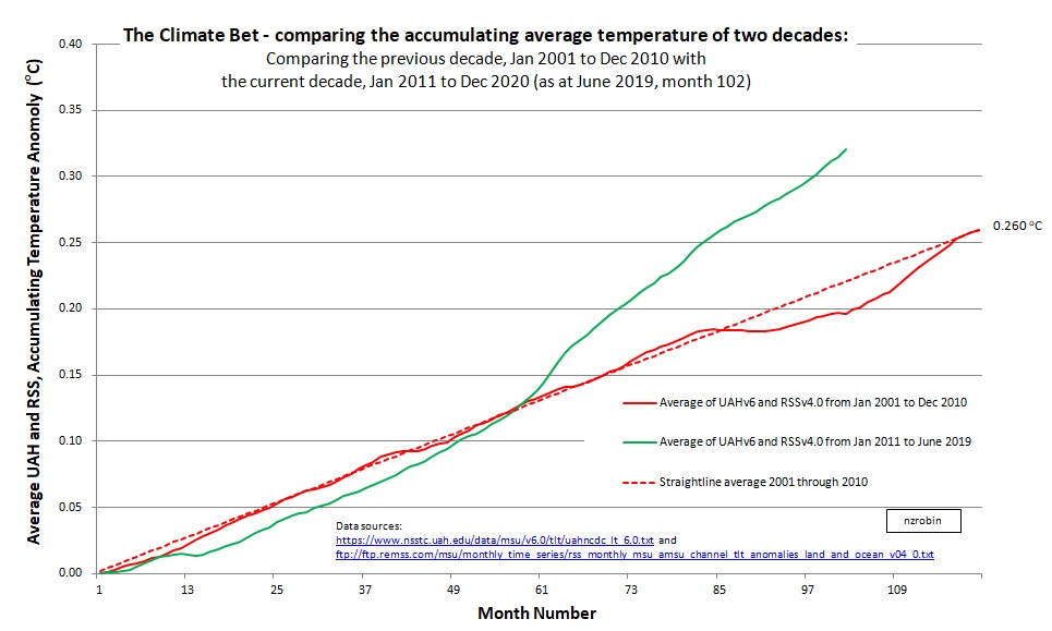
Worksheet with data available here.
Note: The title block in the April and and May graphs is blocking the graphed line. The y-scale has been adjusted and the title block moved in June to reveal the line. Thanks for the observation PhilSI.
Update at 8 years and 5 months: May 2019 (month 101/120)
 Worksheet with data available here.
Update at 8 years and 4 months: April 2019 (month 100/120)
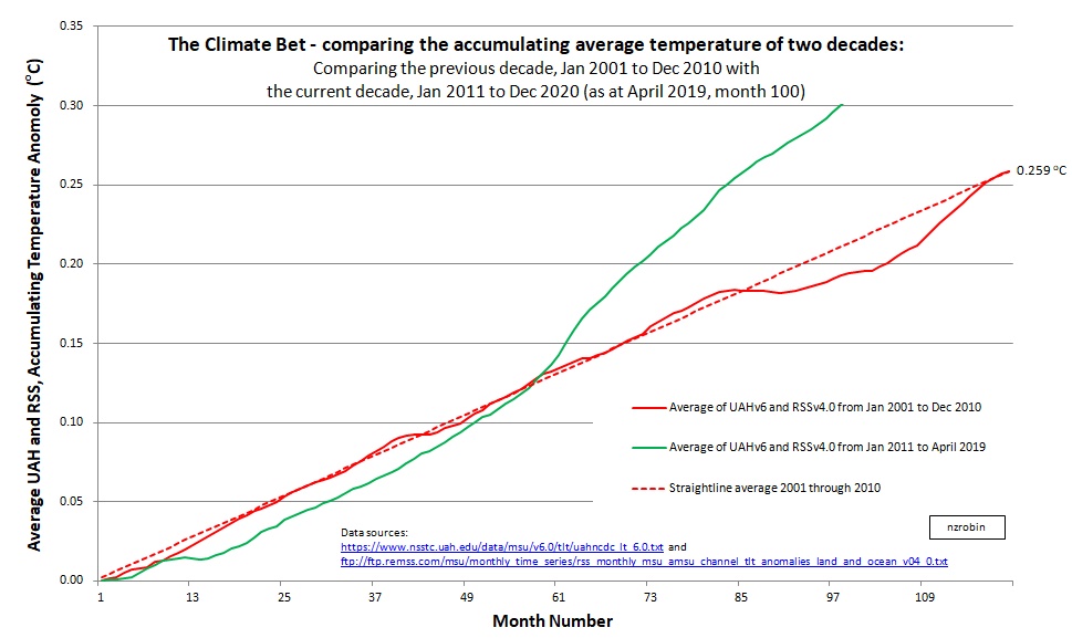
Worksheet with data available here.
Update at 8 years and 3 months: March 2019 (month 99/120)
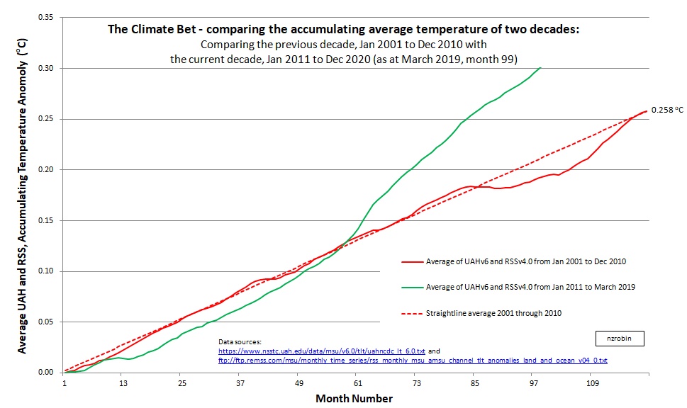
Worksheet with data available here.
Update at 8 years and 2 months: February 2019 (month 98/120)
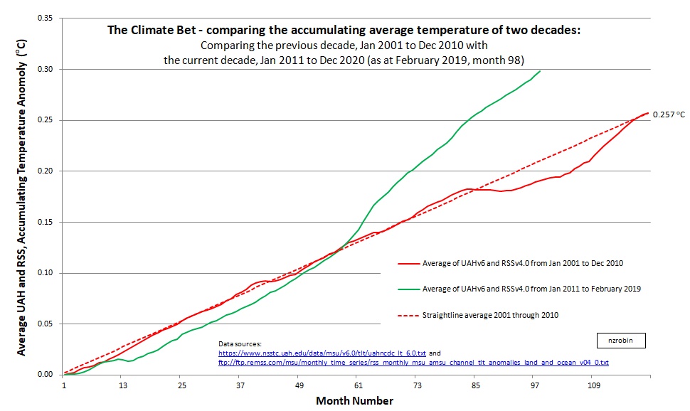
Worksheet with data available here.
Update at 8 years and 1 month: January 2019 (month 97/120)

Worksheet with data available here.
Update at 8 years: December 2018 (month 96/120)
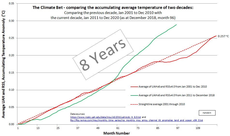
Worksheet with data available here.
Update at 7 years and 11 months: November 2018 (month 95/120)

Worksheet with data available here.
Update at 7 years and 10 months: October 2018 (month 94/120)
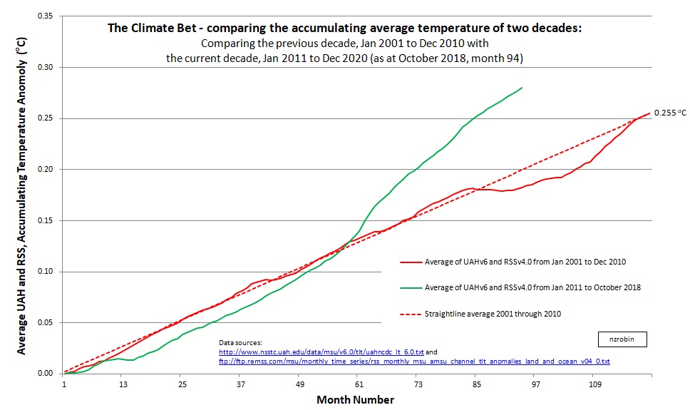
Worksheet with data available here.
Update at 7 years and 9 months: September 2018 (month 93/120)
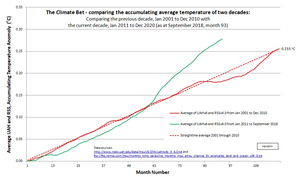
Worksheet with data available here.
Update at 7 years and 8 months: August 2018 (month 92/120)
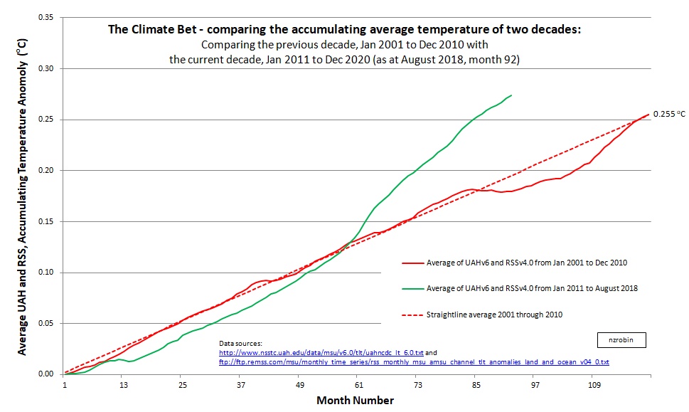
Worksheet with data available here.
Update at 7 years and 7 months: July 2018 (month 91/120)
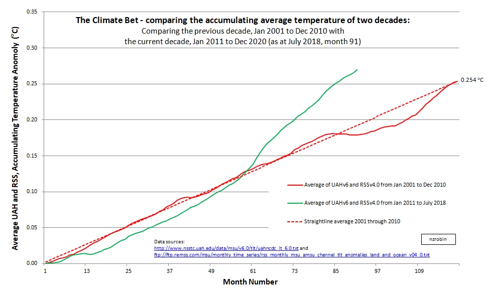
Worksheet with data available here.
Update at 7 years and 6 months: June 2018 (month 90/120)
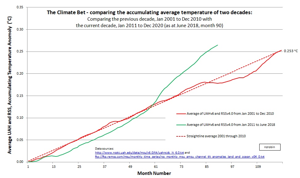
Worksheet with data available here.
Update at 7 years and 5 months: May 2018 (month 89/120)

Worksheet with data available here.
Update at 7 years and 4 months: April 2018 (month 88/120)
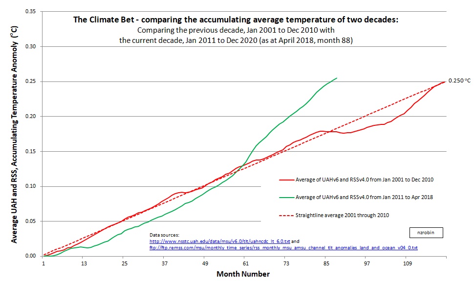
Worksheet with data available here.
Update at 7 years and 3 months: March 2018 (month 87/120)
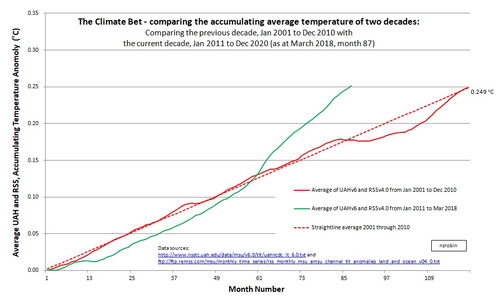
Worksheet with data available here.
Update at 7 years and 2 months: February 2018 (month 86/120)
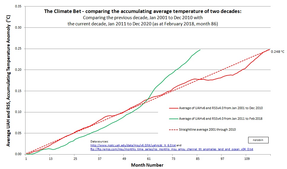
Worksheet with data available here.
Update at 7 years and 1 month: January 2018 (month 85/120)
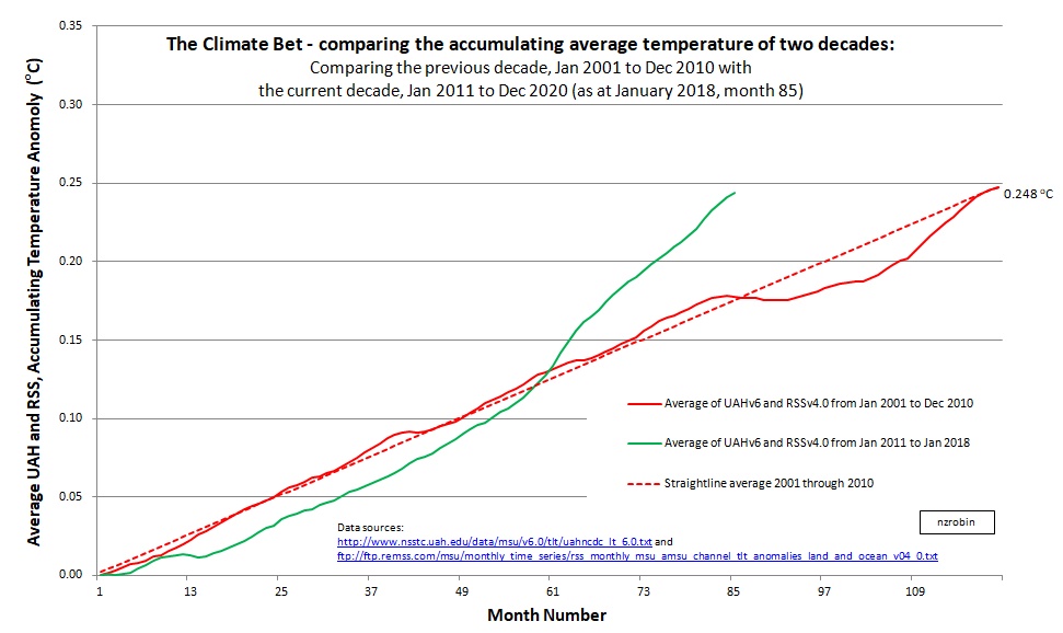
Worksheet with data available here.
Update at 7 years: December 2017 (month 84/120)
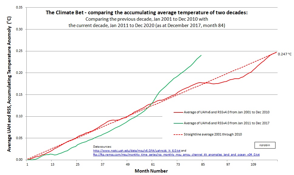
Worksheet with data available here.
Update at 6 years and 11 months: November 2017 (month 83/120)

Worksheet with data available here.
Update at 6 years and 10 months: October 2017 (month 82/120)

Worksheet with data available here.
Update at 6 years and 9 months: September 2017 (month 81/120)
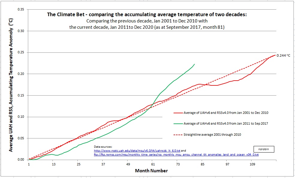
Worksheet with data available here.
Update at 6 years and 8 months: August 2017 (month 80/120)

Worksheet with data available here.
Update at 6 years and 7 months: July 2017 (month 79/120)

Worksheet with data available here.
Update at 6 years and 6 months: June 2017 (month 78/120)

This update includes updated data from RSS to version 4. Clearly the warming team are now further in the lead.
I think it’s highly likely the warming team will win the bet … unless a major La Nina turns down the thermostat several notches, or a huge volcano blows it’s top.
If you’re interested I have stored the Excel worksheet here.
Update at 6 years 5 months: May 2017 (month 77/120):
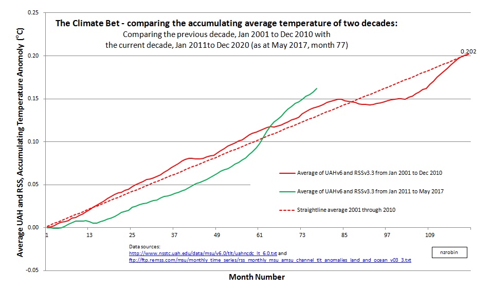
As usual the data sheet is available here.
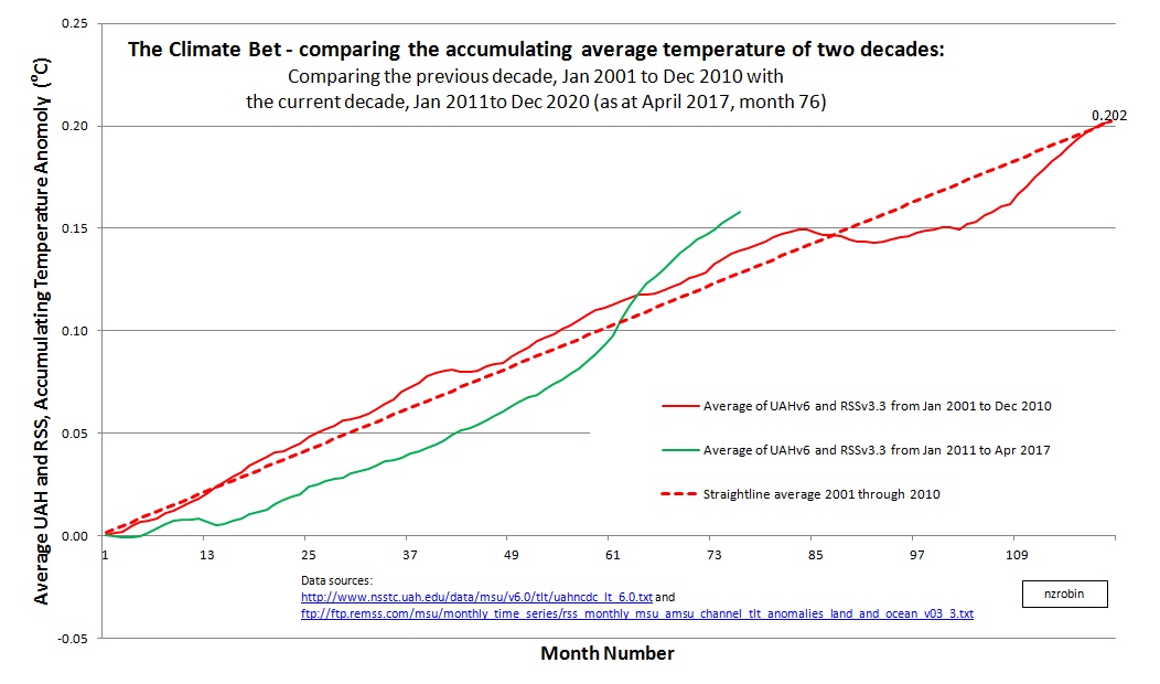
Update at 6 years 4 months: April 2017 (month 76/120):
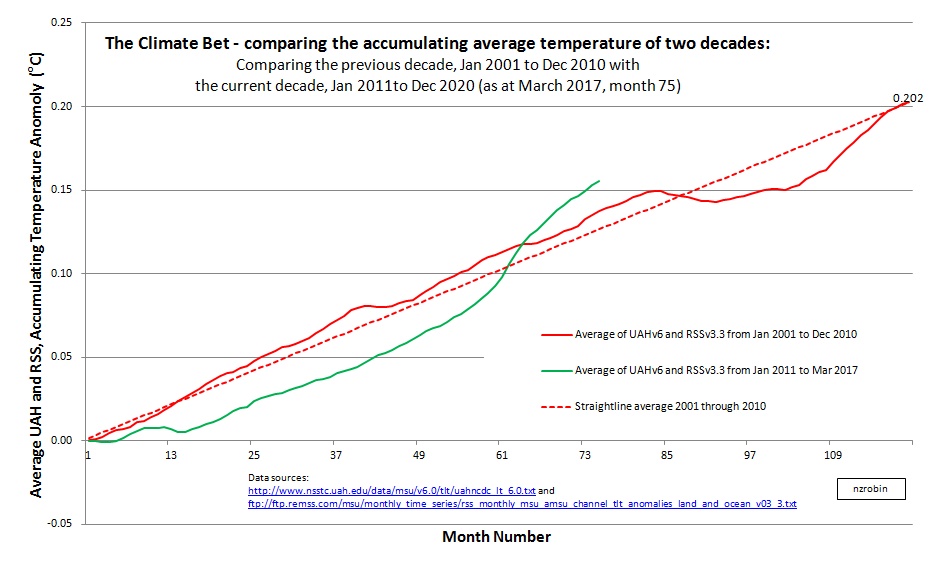
Update at 6 years 3 months: March 2017 (month 75/120): Things are looking similar to what they were 3 months ago with the warmists continuing to lead the bet. As usual the data sheet is available here.
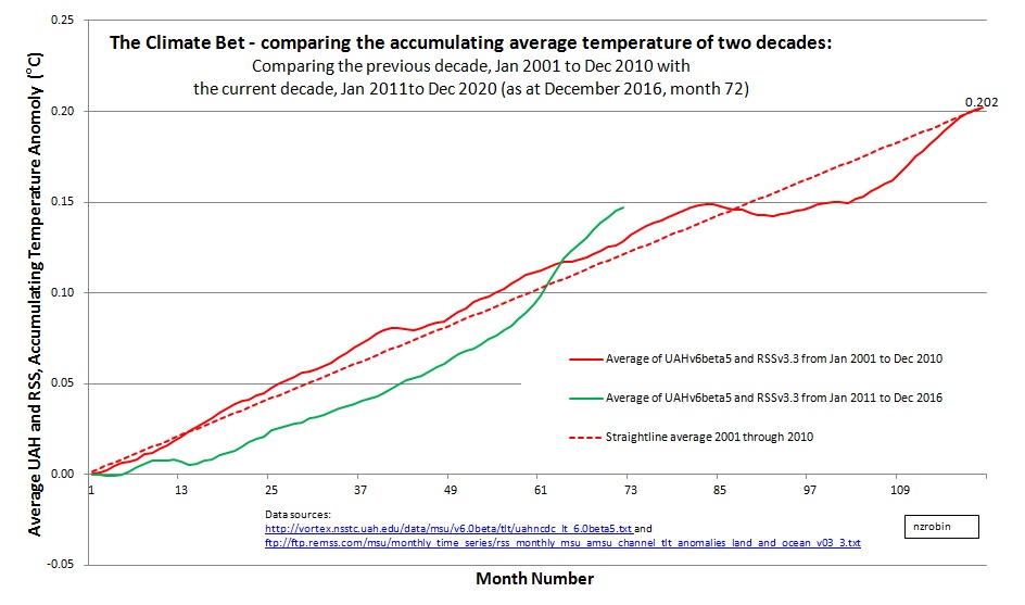
Update at 6 years: December 2016 (month 72/120): Reporting once again that things are much the same as the previous report. The green line remains on top and the warmists continue to lead the bet. The effect of the just started La Nina is looking quite weak as suggested by NASA/GWPF below. The effect is barely visible in the graph … to date anyway. I’ve also heard that there might be another El Nino coming – if that’s the case then the warmists will get another push toward a win. Certainly is an interesting race as we get closer to the finish line. The data sheet is available here.
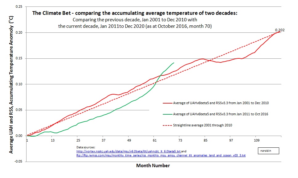
Update: October 2016 (month 70/120): Much the same as the previous report. The green line remains on top and the warmists continue to lead the bet. The warming effect of the recent large El Nino clearly visible. I’m now wondering how much impact the ‘just started’ La Nina will have. NASA/GWPF say it could be ‘weak’.
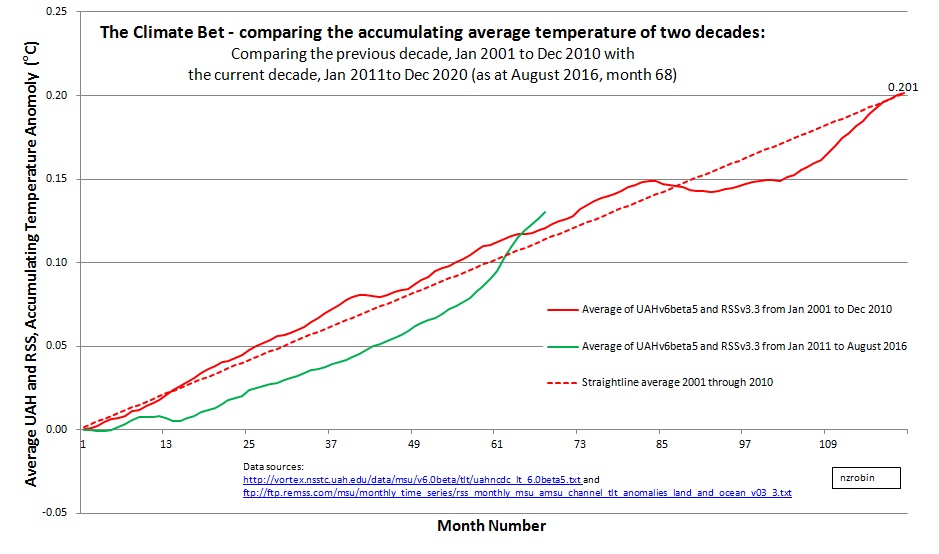
Update: August 2016 (month 68/120): The green line remains on top and the warmists lead the bet. The spreadsheet containing all the data and workings is available here.
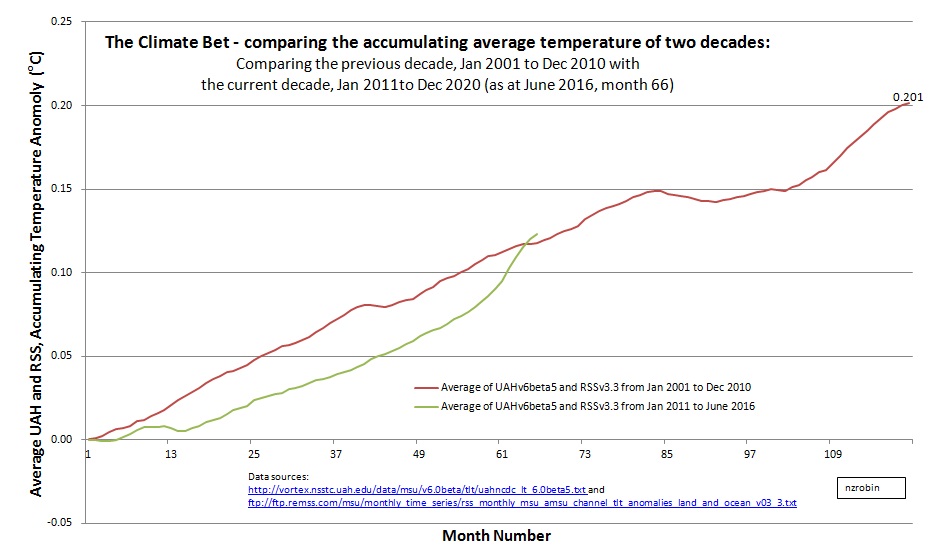
Update: June 2016 (month 66/120): The green line’s slope has started to turn down a little, but it remains on top and the warmists continue to lead. I’m guessing the green line will cross back under the red in five or six months as El Nino fades out and La Nina arrives.
 The data is available as usual at the links below.
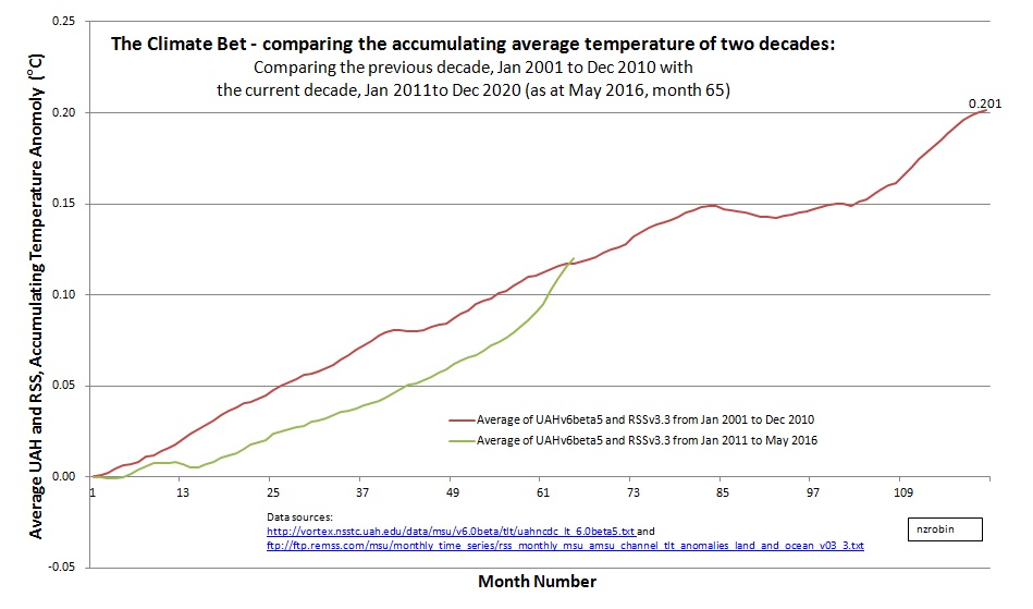
Update: May 2016 (month 65/120): The El Nino has now nudged the green line and we now have the warmists in the lead by a small margin.
The spreadsheet is available here.
UAH v6 Beta 5 data is available here.
RSS v3.3 data is available here.
Update: March 2016 (month 63/120): We’re still seeing the effect of the El Nino nudging the green line closer. Whether the lines cross over, and for how long, is still uncertain. The El Nino indicators seem to have peaked and are beginning to decline, but as Bob Tisdale described at his blog, ‘Every El Nino is different’.
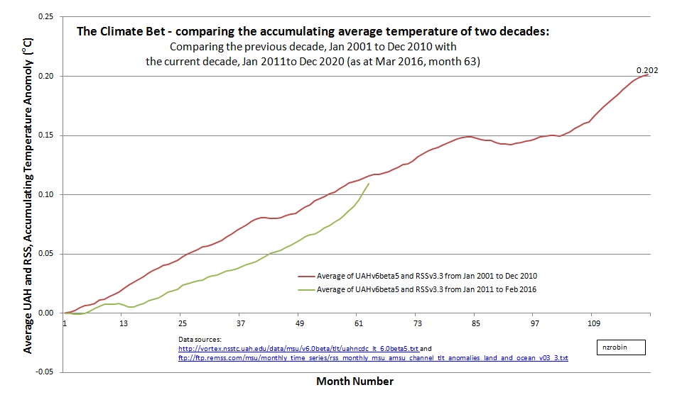
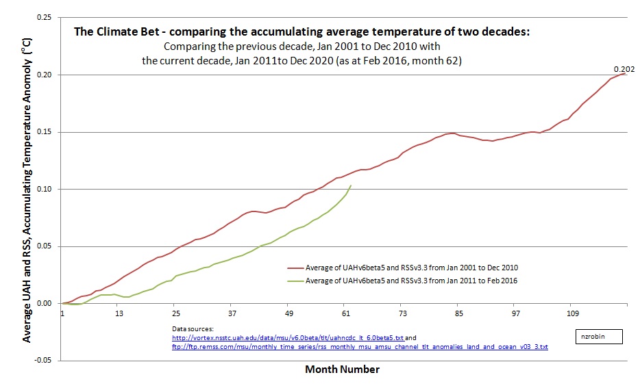
Update: February 2016 (month 62/120): We’re now seeing the effect of the El Nino, and the race is closer still, with the coolists still leading.
 Note: Links to source data and spreadsheet at bottom of page.
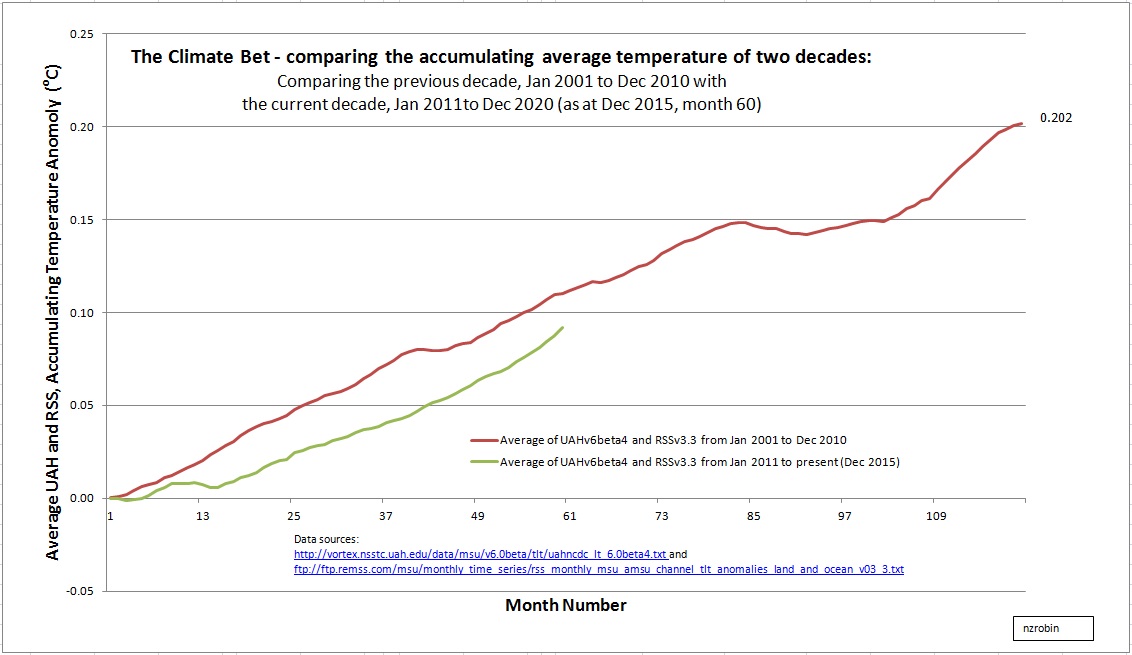
Update: December 2015 (month 60/120):
We’re now at the half way mark; and the present decade is still running cooler than the preceding decade.
The average temperature anomaly for the previous decade (Jan 2001 to Dec 2010) is 0.202 C. The average temperature anomaly for the past 5 years (Jan 2011 to Dec 2015) is 0.184 C. Only 0.018 C difference.
The recent uptick at months 58 through 60 is the beginning of the atmospheric warming caused by the current El Nino. It’s barely visible but definitely there. But I wonder how long it will last? If it continues along the lines of the 2010 El Nino, (which lasted about 9 months with an average anomaly of about 0.47 C) the lines will be very close in July 2016, and the lead could pass to the warmists. However, a La Nina typically follows an El Nino. La Nina brings a cooling, which would likely pass the lead back to the coolists.
Keep watching … I plan to update this each 2 or 3 months.
Background:
A global decadal temperature bet was made in early 2011.
At the time the bet was made (early 2011) December 2010 marked the end of the previous ten year period. January 2011 marked the beginning of the next decade. The transition stimulated the formation of a decadal global climate bet.
And so the coolists (led by Pierre Gosselin – NoTricksZone) and the warmists (led by Rob Honeycutt – Skeptical Science) are having a bet. They agreed to use a composite of Remote Sensing Systems (RSS) and University of Alabama Huntsville (UAH) lower troposphere temperature – close to the earth’s surface. They agreed that the result would be accepted without quibbling, as it was agreed between them that those series are the best that we’ve got. The average of the two series will decide the bet!
I have shown ‘the race’ as it progresses by graphing an accumulating total, ie: adding 1/120th of the average of the UAH and RSS monthly global anomalies month by month. The sum of these numbers after 120 months (10 years) is of course the global decadal average.
Data Links:
The spreadsheet is available here.
UAH v6 Beta 5 data is available here.
RSS v3.3 data is available here.
Pingback: The Decadal Global Climate Bet – October 2015 Update | Kiwi Thinker
Pingback: The Decadal Global Climate Bet – Now at the half way mark | Kiwi Thinker
Pingback: Decadal Global Temperature Bet | NOT A LOT OF PEOPLE KNOW THAT
I would like to tell you of my latest book and documentary.
‘The Deliberate Corruption of Climate Science’.
My latest documentary and video of my presentation.
https://www.youtube.com/watch?v=tPzpPXuASY8
My website is
Thank you.
Tim
https://www.youtube.com/watch?v=tPzpPXuASY8
https://www.youtube.com/watch?v=sO08Hhjes_0
http://www.drtimball.com
Debate between Dr Tim Ball and Elizabeth May
Scroll down to Ian Jessop part 1
http://www.cfax1070.com/Podcasts
Pingback: Despite Massive El Nino, Current Decade Still Cooler Than 2001 – 2010 Decade!
Pingback: Despite Massive El Nino, Current Decade Still Cooler Than 2001–2010 Decade | The Global Warming Policy Forum (GWPF)
Pingback: Green Madness: EU Climate Finance Subsidises Chinese Steel Industry | Atlas Monitor
After Bob Carter pointed out “the pause” in 2007, the alarmists have been keen to talk a lot about decadal temperatures.
This graph is very illuminating but it is, of course, all intra-pause. Could you produce another version, which shows the decades of the 1990s and 1980s as well?
Thanks Barry,
Will do.
Robin.
With regard to your graph, it misses the key point that in order to win the bet, the 2010s temperature must be below the average rate of increase over the full decade of the 2000s, not just the decade to date. Thus, if the green line were to fall back to the red line over the next six months, and sustain the same average rate of increase thereafter, the climate “skeptics” would lose the bet. Your graph would be improved by including a benchmark showing the mean rate of increase over the full decade of the 2010s as in this example.
That’s a good idea Tom. I’ll add an average line for the 2000 to 2010 series with the August update. I hope to do that next weekend; 10 or 11 September.
Interesting stuff, Anthony, and I’m glad to have chanced across your blog.
I too am interested in “accumulated” data, but I use cumulative sums relative to a base level, most frequently the mean for the period under consideration. Have been doing this since 1992 with climate data, so have made many thousands of cusum plots for a very wide range of parameters.
These plots -which I can’t post here because I do not know how, but can readily send as GIFs or JPEGs by email -, are a telling means of assessing climate time series. They provide immediate information on the large scale historical behaviour of the series, enabling a rational decision on whether the almost ubiquitous linear model espoused by climate scientists has any support from the actual data.
I am especially interested in abrupt change. This is what cusum technology, such as it is, was designed for in the 1950s, in connection with SQC. It worked then, using (perforce) hand calculation, and it works now.
I would be very happy to send you details of my analyses of any data set you choose, provided that I can download it. Just contact me by email.
Cheers, Robin
Thanks for making contact Robin. I would be interested if you have done a cumulative sum of outgoing long wave infra-red over say 10 year periods. I had a go at this with an earlier post and wouldn’t mind comparing results if you have.
You wrote: “Update: June 2016 (month 66/120): … I’m guessing the green line will cross back under the red in five or six months as El Nino fades out and La Nina arrives.”
Sorry, but it’s now seven months later and with Roy’s latest post about UAH (+0.30 in January) there’s still no sign of the green line turning back.
My guess is that the green line stays comfortably above the red one for the remaining 47 months, and that Pierre Gosselin’s crowd has to pay up.
I’m also guessing that many of them will blame it on the 2016 El Nino.
Then there’s the issue of changes to the data series. When UAH switched their LT product from 5.6 to 6.0, it gave a boost to the “cooling” side. (For 2011-2016, the UAH/RSS average is 0.3 with the “old” UAH but only 0.24 with the “new” one.) If RSS eventually updates their LT product to v4, it will probably have the opposite effect. This will give the NTZ readers another thing to complain about.
Hi Jane, yes, my guess back in June 2016 certainly underestimated the effect of the El Nino. And since then the following La Nina was small, and now we have another El Nino forming. And the likelihood of the green line crossing back under the red looking much less likely, especially as Annie points out, there’s the 10 year anniversary of the 2008 La Nina to contend with.
I can’t comment much on the tweaks to the UAH, and maybe later RSS series. I do notice the tweaks of course, but I just do my best to reflect their latest data sets accurately.
It continues to be quite warm. And we’re now approaching the 10-year anniversary of the very cold year of 2008 … which will make it extremely difficult for the “coolists” to regain the lead. So my guess is that this race is basically over now; it’s just a matter of waiting for the inevitable.
It’s too bad, really. Mostly because for the sake of the planet I’d be happier if there were in fact some strong negative feedback that acted to stabilize the climate and prevent it from warming/cooling. That would be nice.
But also because as I understand it the “warmists” pledged quite a bit more money towards this bet than the “coolists” did. So if the “coolists” won, it would be a better deal for charity. But that seems unlikely.
Hi Annie, yes – as we approach to 10 year anniversary of the 2008 La Nina, it seems very unlikely that the coolists will regain the lead. However, even though the race looks like it might be over, I will aim to update every two or three months.
I see the data sets have been updated and reflected here (new UAH version).
I’m curious about the use of UAHv6.5. The methods paper hasn’t been published as yet.
What is the cut-off for new versions of the satellite data as you approach the finish line? As soon as beta data appear on the net or something else?
Hi Barry, Great timing. As it turns out, the day after your comment (6th) Roy Spencer advises Version 6 paper is now published (7th). Here’s a link to his post http://www.drroyspencer.com/2017/03/uah-version-6-dataset-paper-published-online/. And here’s a link to the paper itself http://www.drroyspencer.com/wp-content/uploads/APJAS-2016-UAH-Version-6-Global-Satellite-Temperature-Products-for-blog-post.pdf.
Regarding your point about new versions and cut-off dates. I am simply taking the latest satellite data presented by each of UAH and RSS, averaging, and graphing progress. The tweaks from one version to the next have been very small and are hardly visible.
Anthony,
RSS TLT dataset now updated from V_3.3 to V_4.0, accompanied by peer reviewed publication: http://journals.ametsoc.org/doi/abs/10.1175/JCLI-D-16-0768.1
Big increase in RSS rate of warming since 2001 which affects both decadal periods, but the latest one much more so.
As of the latest month (month 77) the current decade stands at 0.317C versus 0.203C for the previous decade.
Latest RSS TLT data to May 2017 available here: http://images.remss.com/data/msu/graphics/TLT_v40/time_series/RSS_TS_channel_TLT_Global_Land_And_Sea_v04_0.txt
Thanks David, I’ve been waiting for their updated series. Seems RSS’s update has turned out pretty much as Roy Spencer predicted about 6 months ago. Some commentary at Paul Homewood’s site covering the update. https://notalotofpeopleknowthat.wordpress.com/2017/06/30/rss-find-their-missing-warming/
Paul Homewood’s reaction is slightly disappointing. The pattern is obvious here. A lot of people who call themselves “skeptics” were pleased to see Spencer and Christy adjusting their trend downward from UAH 5.6 to 6.0, but are furious that Mears and Wentz have similarly adjusted RSS upward.
It makes me question how many people who call themselves “skeptics” are genuinely “skeptical” as opposed to simply being firmly committed to one side.
Ironically, for those of us who have been averaging UAH and RSS, this brings us back to where we were before either of the updates. As of right now, the average of the trends in the old versions is 0.15 C/decade … and the average of the trends in the new versions is ALSO 0.15 C/decade.
So ignore all the sturm und drang, and carry on with the graphs. We’ll see where this bet ends up.
Thanks for your thoughts Annie. Yep, I shall carry on with the graphs using the most up to date data from UAH and RSS as originally intended.
Hi Anthony, yes the newer version of the RSS data greatly enhances the lead for the current decade compared to the previous decade.
Currently using the old figures incorporating v3.3, the lead is 16% but using the new RSS version the lead jumps to 24%. It is going to require a massive volcano or a the arrival of a sudden ice age for the fat lady to change her tune.
A prolonged La Nina is not going to cut it as the average UAH and RSS would be required to average 0.1 C or lower for the next 41 months. The last time the average over 41 months was that low, was June 1996. Anything is possible but this bet appears to be over.
It’s interesting that under the older versions of both UAH and RSS, the current decade’s lead would actually be much larger. The lead became smaller when UAH was updated but RSS wasn’t yet. Then it increased again when RSS was finally updated, but still not as high as it would have been if one had stuck with the original versions of UAH 5.6 and RSS 3.3.
Thanks for the monthly update. I agree with your comment that “it’s highly likely the warming team will win the bet … unless a major La Nina turns down the thermostat several notches, or a huge volcano blows it’s top.”
In fact, I don’t think either of those would be enough. There were big volcanoes in ’82 (El Chichon) and ’91 (Pinatubo), and five La Ninas during the satellite record. But the kind of cooling you’d need for the current decade to drop below the previous decade hasn’t ever occurred in the satellite record.
As you note on your chart, the average (RSS & UAH) for the previous decade was 0.243. We are 78 months into the current decade and the average is 0.320. In order to end up cooler than the previous decade, the remaining 42 months would have to average 0.100 or lower. Thus, the difference between the next 42 months and the previous 78 months would have to be at least 0.22.
The largest 42-month cooling in the satellite record (relative to its preceding 78 months) is 0.077, starting in the fall of 1991 (i.e., Pinatubo). The next largest cooling period started in late 2007 (i.e., the 2008 and 2010 La Ninas), and was 0.064.
So the cooling required for the “warmists” to lose this bet would be approx three times larger than anything in the satellite record. Maybe a record-breaking volcano at the same time as a record-breaking La Nina would do it? Throw in an asteroid strike and it’s possible, sure.
Nice blog, by the way.
Thanks for the analytical comments Darcy. I think I’d rather “suffer” a little warming than be struck by an asteroid and/or volcano debris. And thanks too, for the compliment.
Just curious — in the July update you give the previous decade’s average as 0.243, then in August it was 0.244, and in October it was 0.245. I didn’t hear about either UAH or RSS releasing a new version during this time. Do the older (2001-2010) monthly temperatures change on a regular basis? Do you know whether it is UAH, RSS, or both, that changed?
Admittedly it’s a pretty minor change — 1000ths of a degree. So not a big deal.
Each month I download the complete set of data from both UAH and RSS. Sometimes some of the historical monthly anomalies have changed a little from earlier downloads. The changes are generally small, typically less than 0.01C, and applying only to a few numbers. The biggest recent change was when the RSS series was updated from v3.3 to v4. I’ll prepare an Excel spreadsheet of the recent six downloads highlighting the month to month changes and put it in Google drive. I’ll put a link to it in the next comment.
And here is the link to the previous eight months of downloads. I have laid each month out side by side and compared each reading with the previous record using a conditional format. Blue means the temperature has been adjusted down from the previous reading, red means it has been adjusted up. The darker the colour the bigger the adjustment. Here’s the link to the Excel spreadsheet.
And PS. The formatting does not display correctly in Google Docs. To view correctly you’ll need to download the file and open in Excel. Cheers, Robin.
Thanks Anthony.
Obviously if you were to stretch the monthly values back to the UAH update from v5.6 to version v6.0 we would see a similar scale of change to that seen in the more recent RSS v3.3 to v4.0 update, only in the opposite direction. Basically both changes cancel one another out over the term of the bet period to date.
It looks to me like the current decade’s cumulative value will exceed last decade’s final value in two or three months from now … with 2+ years still to go.
December’s value was 0.2409
January’s was 0.2443
That increase brought us more than halfway to last decade’s value (0.2476)
So we could make the target when February’s value is reported. Or it may take until March.
The bet was till 2020. There is some prospect of cooling from now till then so the fact that the last decade temperate rise is exceeded at some point this decade does not mean it will still exceed it at the end of the decade. It is the reading on December 2020 that matters.
That’s correct, RickWill. And in fact it has cooled (slightly) since the peak of the 2016 El Nino.
But the odds of it cooling enough to drop the 2010s average below the 2000s average are … not good. Not good at all.
There are 34 months remaining in the bet. In order for the “cool” side to win, those 34 months would have to average less than 0.00 C.
For comparison, the most recent 34 months averaged +0.53 C. Now that includes the El Nino, but there has never been a drop in the 34-month rolling average bigger than 0.10 C. Not from Pinatubo, not from the 1998 El Nino.
So for the “cool” side to win, the next 34 months would need to see a temperature drop that was 5X bigger than anything in the past record.
Here’s a histogram of the 34-month change in the 34-month rolling average:
https://imgur.com/Pk4eoG5
You can judge for yourself how likely it is to have a drop of the required magnitude.
FWIW, the odds are getting worse and worse, too.
When I posted the previous comment back in July, the “coolists” would have needed a temperature drop 3X the previous record to beat the “warmists”.
Now, 8 months later, they need to beat the previous record by 5X.
Roy Spencer has the UAH at 0.2C above the long term average in February. March certainly appears cooler in the northern hemisphere so it might get down to 0C for March.
The CERES radiation data shows net heat input for January but their absolute values are doubtful and January always has more heat uptake due to the sun being over more ocean. The 0-700m ocean temps have not increased in two years. So there is is some prospect of cooling. Certainly solar activity is low.
I included the UAH (and RSS) values for February in the above calculation.
Look, back in July there were still 42 months left. Those months needed to *average* below 0.10 C in order for the coolists to win.
Now eight more months have gone by. None of them were below that 0.1 C target. So now there are only 34 months left and the target is pushed down to 0.0 C.
It’s going in the wrong direction for the coolists. Every month that passes makes the average needed for the remaining months that much lower. We’re now at the point where it’s unlikely that *any* months will be below the target, let alone that all 34 remaining months will average below it.
Saying 0-700m ocean temps havent increased in 2 years is a very optimistic way of looking at them. The big El Nino moves heat from ocean to atmosphere so temps in upper 100m drop but it has bounced back up again during the La Nina. Averaged over periods longer than ENSO, the trend is relentlessly upward. The effect of the solar cycle on temp is very small.
First few days of March have seen some very cold areas in parts of the NH but a fair bit of abnormally hot too especially in Arctic. Not sure I would bet on a cold spring – arctic sea ice has possibly reached maximum already.
Meanwhile GHG continue to grow and ENSO moves toward neutral. I’d say the chances of getting any cooling arent good, let alone enough cooling to dent the graph. Best bet would be a really huge volcano somewhere in the tropic. The Philippines and Indonesia have some candidates.
tl;dr version:
Pierre Gosselin should probably begin breaking it to his commentators that they’re going to have to be prepared to pay up.
He posted quite a bit about this in the early years when the cool side was briefly leading, but stopped once the positions switched.
And with the March data now in for both UAH and RSS, the cumulative value for the 2010s has now officially exceeded that from the 2000s.
If the remaining 33 months simply follow the average of the past 12 months (ENSO-neutral to cool conditions) with no warming, we will end up around 0.38, off the top of the chart. So there’s a good chance you’ll need to expand the Y-axis again.
I wonder if anyone will want to bet on the *next* decade?
Hmm, now December and no October update yet.
Been a bit distracted. Thanks for the reminder. October done now.
Thanks for update but I notice that the May picture seems to be the same as April, and doesnt reflect the graph in the supplied spreadsheet. Looks like a typo in the post.
Thanks. Good spotting. The heading is in front of the graph. I’ll change the vertical scale in the next update.
Notice that May graphic is the same as April and doesnt match the worksheet
Thanks. Same problem. The graph heading is in the way. Will be fixed with the June update.
A year ago I wrote: “So there’s a good chance you’ll need to expand the Y-axis again.”
And there it is! Hopefully, the line won’t go off the top of the chart by the end of 2020, though it could be a close call.
Thanks for the updates.
Also … following up on the comment by “Oig” above, it’s interesting how the previous decade’s data have continued to creep upwards. In April 2017, the previous decade’s average was 0.243, while by now it’s up to 0.260. The 2010s are having to beat a moving target there…
I’m annoyed, now that I check up on this after several years, to find that Mr. Gosselin never added me to the list of warm side bettors – permalink to my pledging $500 in September 2011 is https://notrickszone.com/join-the-climate-bet-for-charity/#comment-51803.
A year and a half ago, Rick Will wrote:
“The bet was till 2020. There is some prospect of cooling from now till then so the fact that the last decade temperate rise is exceeded at some point this decade does not mean it will still exceed it at the end of the decade. It is the reading on December 2020 that matters.”
I replied:
“the odds of it cooling enough to drop the 2010s average below the 2000s average are … not good. Not good at all.”
Now there are only 15 months left in the bet. In order for the Coolists to win, those remaining months would have to *average* below -0.61 in the RSS+UAH mean.
But in the nearly 4 decades of data, there has never been even a single month that cold. In this decade, there hasn’t been a single year below -0.1. In the past 5 years, the *coldest* month has been +0.24.
Here’s the comparison of 1980s, 1990s, 2000s, and 2010s. Seems pretty clear to me:
https://i.imgur.com/vfJ2p2g.jpg
“Hopefully, the line won’t go off the top of the chart by the end of 2020, though it could be a close call.”
By my projection, in the final month of the bet (Dec 2020) it will be just about exactly +0.40. And the forecast seems to be for ENSO-neutral conditions to continue for a while.
So there’s about a 50-50 chance that you’ll need to raise the top of the chart again … but we won’t know for sure until literally the last few months of the betting period.
Perhaps time for Mr Gosselin to put this ‘bet’ out of its misery?
No! Watching this unfold month by month is perversely interesting, kind of like a slow-motion train wreck. Don’t stop.
It’s ain’t over til it’s over.
Looks like NTZ have thrown the towell in at last: https://notrickszone.com/2020/11/18/current-decade-globally-warmer-than-previous-decade-due-to-powerful-natural-oceanic-cycles-not-co2/
Apparently it was all due to El Nino. This is odd because NOAA’s ENSO Index suggests conditions over the past 10 years average out at more or less neutral (currently less than +0.1, where El Nino conditions are +0.5 and La Nina -0.5).
There’s another ‘bet’ for the next decade if anyone’s interested. Thanks to Anthony for your work tracking the data here.
Thanks David. It is my intention to start a new graph for the next decade early in the new year. Re the final graph for this decade. If time permits I might also add a couple of extra graphs; one for each of RSS and UAH.
Looks like you’re going to have to raise the top of the chart again in a few months.
Almost made it … but it’s rising just a little too fast, and there’s too many months still left in 2020.
And by my calculations the line has now gone off the top of the chart (current value 0.403). There are only four months left in the bet. In order for the line to drop back onto the chart, the next four months would have to average -0.1 C. But there’s only been one month that cold in the past decade (Feb 2012) and the most recent four months have averaged +0.6 C.
I think you need to expand the chart again. The 2010s curve will probably end up around 0.42 once December’s numbers are in, so an upper bound of 0.45 should be safe.
You’re right. I’ll need to extend the scale again with the next chart. 🙂
“Warmists” are consistently able to make predictions that are correct.
To philosopher of science Imre Lakatos, this was a clear signal of a successful research program. “Coolists” have to come up with ad hoc adjustments to their central idea. In the long run, this is characteristic of pseudoscience, in Lakatos’ philosophy.
See: https://www.lse.ac.uk/philosophy/lakatos/